

Grato is a casually elegant, chef-driven restaurant in West Palm Beach that blends Italian roots with globally inspired, rotating cuisine in a modern, community-focused dining experience.

Background
Grato is a chef-driven restaurant in West Palm Beach that blends Italian roots with globally inspired cuisine in a modern, approachable setting. As a hybrid dining concept, it brings together a range of culinary influences into one cohesive, experience-driven space.
Challenge
The challenge was to design Italian-inspired menus that stood out visually, using a playful yet refined Art Deco style to differentiate the brand. The goal was to create something memorable that reflected both tradition and a fresh, modern personality.
Solution
We developed a bold visual direction using high-contrast color palettes and iconic imagery rooted in Italian culture. The result was a distinctive menu system that feels vibrant, expressive, and instantly recognizable.


Typography
The Grato typography system blends Taroca, La Venice Pro, Montserrat, and Baskerville to create a refined balance of personality, elegance, and readability. Taroca and La Venice Pro bring expressive, Italian-inspired character, while Montserrat adds clean modern structure and Baskerville introduces a classic serif sophistication rooted in historic print tradition.


Photography
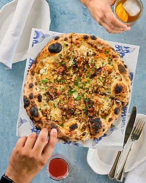
The photography direction for Grato captures the warmth and energy of the dining experience, blending rich food imagery with candid lifestyle moments. Natural lighting, texture, and composition highlight the craftsmanship of each dish while reinforcing the restaurant’s vibrant, inviting atmosphere.


